 |
| All photos in this blog post were taken by myself on a photo tour of the Frank Lloyd Wright Home and Studio in Oak Park, Chicago. I was given permission by the Trust to take these pictures and do not use them to garner any wages from such. |
While visiting Chicago recently, I made every effort to see as much Frank Lloyd Wright work as possible. I have been to see his work several times before, but each time I see something new or have an altered angle/perspective. Likely my impressions of his work are filtered through the lens of what I am currently thinking/writing about architecturally.
During this visit, I was intent on trying to put myself into Frank Lloyd Wright's shoes. I was attempting to figure out what it was like for him to pave a bold new path toward a distinct, popular architecture. On this visit, in particular, I was so much in love with Wright's ability to fill up all three dimensions of space. Not only was every surface articulated with some trim, particular paint, mural, or innovative material, but he was constantly thinking about how space can flow from one room to the next and with verticality.
In particular, Frank Lloyd Wright places a mirror above the centralized hearth in the home. While on the tour, a fellow visitor asked the tour guide if there was a room beyond the fireplace. Delighted that the visitor had asked, the tour guide chuckled as she noted that the mirror was a trompe l'oeil. I saw it as a design move to play with space that allows visual lines to continue throughout the home. Frank Lloyd Wright most certainly, if there is even one thing we can say about him, most certainly did not like the Victorian idea that each room in a home has its defined cubic space. Therefore, he made every attempt to string the rooms together with meaningful design strategies.
As our tour was guided through the original living room space toward the kitchen/pantry area that led into the dining room, space continued freely. For example, Frank Lloyd Wright cut strategic holes out of connecting walls so that the person in space could see to the next adjoining areas and essentially feel like they were in more than one room at a time. I find it brilliant and do believe that many people misunderstand Wright's work.
Many historians, tour guides, book authors spend a great deal of time putting cute little antics with Wright's work. Me, however, I believe he just had an outstanding ability to understand the fullness of space. Nothing for him was two-dimensional. In fact, I think even though he was skilled at drawing, that he much preferred to build with his hands, to create sculptural pieces. This may be evidenced by his insatiable ability to design furniture along with the home itself.
One of my favorite bits of info we learned on our Chicago FLW tour was at the Robie House... which I will do a separate blog on that house itself. Apparently Wright told the women who lived in the Robie House what to wear. I know it sounds awful for him to have told his clients what to wear, but from his perspective, I believe he was so intent on creating a complete project that worked together with all its pieces, that he abstractly (without regard for their feelings, personal taste, etiquette, etc.) asked them to fully participate in his architecture with their clothing.
With so much more that I could write, I hope to at least add a few more comments on the photos below. In conclusion, Frank Lloyd Wright, and his work is rather more complicated than it is often portrayed. I am continually intrigued and hope to continue to learn more from his example.

The entrance to Wright's Studio is located in between these columns; hidden of sorts. Brilliant!
|

How often, or when have you seen a double-layered roof structure? This design move allows natural sunlight to flood the porch.

Carving out space for a sofa in the "wall" is a smooth architectural move.

The tile flooring in the dining room.
This tile was also used for the fireplace and the wall next to the fireplace in the dining room.

This window in the dining room shows a double-layered wall.

Very advanced ceiling ornament. Light behind the lattice-work.
The chairs were meant to create an intimate space within a larger space.

The photo was taken at eye-level if one were sitting in the chairs.

Stencil work in the childrens' bedroom.

The ceiling is articulated and is high because there was no attic in this home.

Notice the cut-out in the roof structure.

Beautiful Native American-themed murals.

One of my most favorite moments in the home.
Since he could not get a window in front of the sink, he captured the natural sunlight
from the side. Brilliant.

Rusticated wall material near the tub.

Another trompe l'oeil. This cabinet appears to be only inches deep when, in fact, it is several feet deep; in fact one of the two matching cabinets has a staff restroom located inside.

Beautiful windows located at the top of the wall.

Peering through Frank Lloyd Wright's articulated window, one sees what would have
been a typical home built at the same time as Wright's home.

Mmm, love that trim.

This space is anything but two-dimensional. Wright arched out the base wall and
added windows at the top; making it an euphoric nursery.

The ceiling in the childrens' playroom is quite elaborate and framed by trim.
It would indeed invoke childhood imagination.

These light fixtures were likely inspired by Japanese architecture. They do illustrate, however, Wright's sculptural talents as he designed these as well for the children's playspace.

Play of light in space.

Great care for detail.

Children's play space mural.

Barrel-vaulted space; one of my personal favorite shapes of spaces.

Not only did he design these elaborate light fixtures, but how did he attach them to the brick wall?

Taking advantage of many layers of space.

Super awesome. Wright placed the piano in such a way that it goes
through the wall and is suspended overhead in the servant's stairway below.

Piano above. Invokes a bit of fear when traveling underneath.

Wright's sculptural design insignia for his Studio.
No one knows if the floor plan references an actual building.

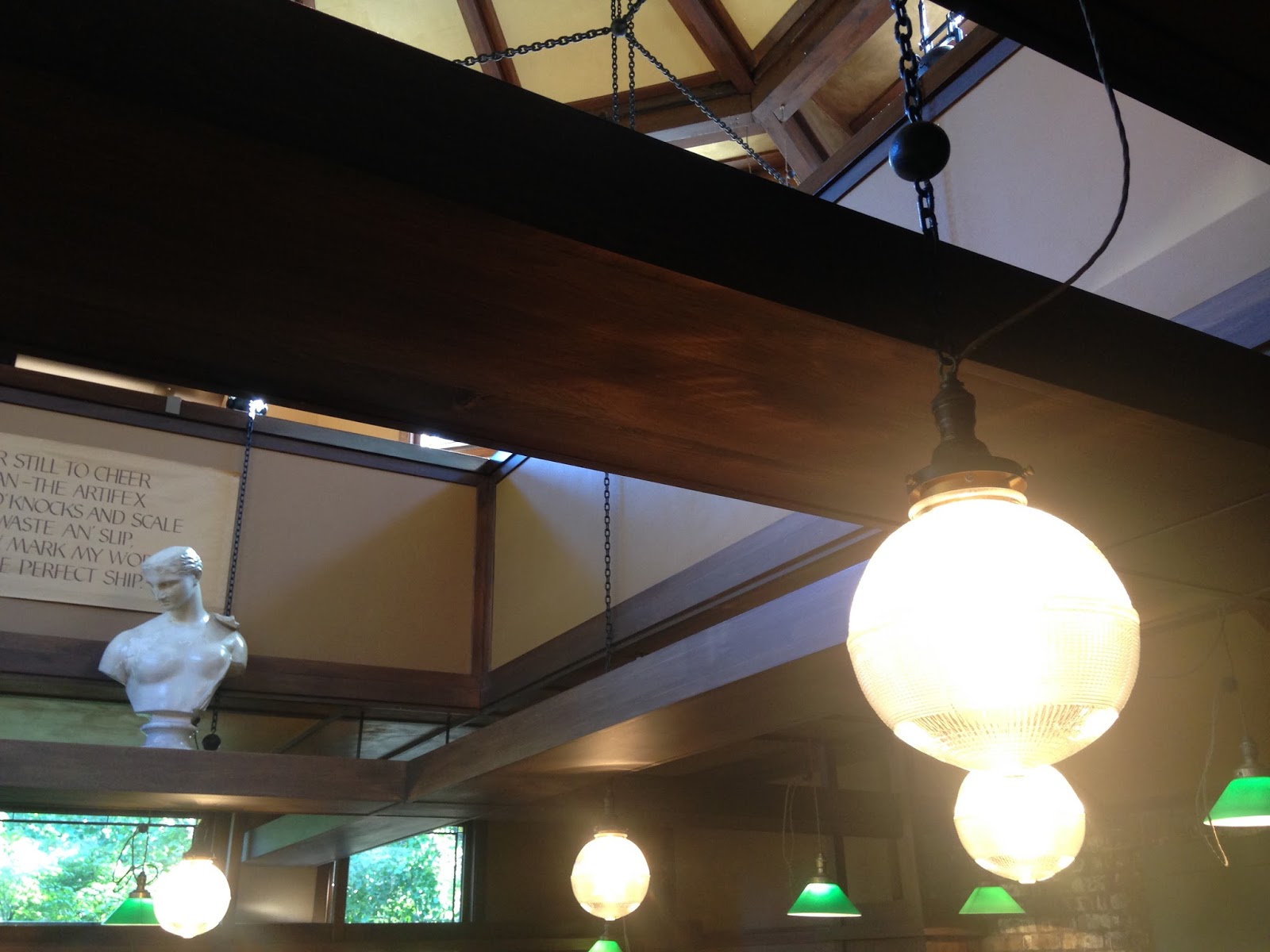
Wright's centralized ceiling in the Studio. The chains are an integral part of the structure.

Wright's ability to layer space vertically becomes more sophisticated in the Studio.
The Studio was designed after the home.

I do not know what these figures meant to Wright, but they are gorgeous and appear to be free.

Light and whimsical. Located directly above the hearth?
Again, vertical layers of space.

Wright designed the drafting tables.

An existing tree was allowed precedence over the building.

The Studio with massive amounts of natural sunlight.

Entryway art glass on the ceiling - not on the wall mind you.

Layers of windows.

Pin-up space for drawings.

Light fixtures are hung elegantly by their exposed wires.

Client seating. Look like throne chairs?

Only beautiful. Thank you, Frank Lloyd Wright, and the Trust for preserving the home and studio.
No comments:
Post a Comment